IAM
The Problem
The IAM team has always wanted their site is easily accessible and understandable. It is an intranet site that helps any team that needs help with Identity & Access Management for their users.
My Role
Help the team get a direction on what’s important.
Stick to design principles and collaborate with business and development.
Back decisions based on data.
Skills used
UX Research, Information Architecture, Visual design
Tools used
MICROSOFT EXCEL, PAPER & PENCIL, Sketch
What was expected out of the project?
Broader goal is to make it easier for the user to connect with IAM team.
Approachable - The user should be able to easily reach out to us for service & assistance.
Discoverable - The user should be able to know what we do, the process and how we do.
Accessible - The user should not have any accessibility issues. ( Should follow minimum accessibility guidelines)
Readable - The content we provide should be easily readable and relatable.
Analysis - What was missing in the current intranet site?
Groups of content - The content grouping was a cause of concern. The content seems to be distributed across instead of a structured approach of content. Example: “Explore services” and “patterns” are duplicate headings and content which can be avoided by proper grouping of content.
Informing the users of their current page or going back - Although breadcrumbs are not saviours of the day, sometimes when the user get’s lost in the site, there was no way to figure out how to undo or go back to the place they just came from.
Titles - Menu items such as “Documentation” and “News” had vague titles that may be improved.
Titles in a logical order - Titles did not follow any logical order. Example - “Engage us” and “Ask us anything” are two same actions in the menu that can be combined or re-ordered.
Fluid Navigation - Users had to always either rely on the main navigation or get back home to change his style of browsing. Example when browsing “Documentation” page, the only way to find “Glossary” is to find it in the main navigation.
How the home page looked before we made changesSince majority of the problems looked and pointed us to information architecture, we decided to fix it as a priority.
“Good information architecture makes users less alienated and supressed by technology”
The Information Architecture
How the information was being navigatedGoals
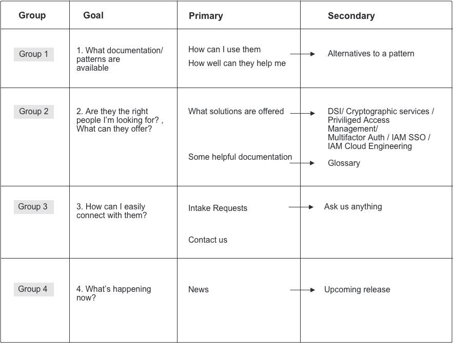
Our team decided the goals for our redesign. As we decided earlier that the broader goal is to make the website more easier to understand, we divided them into primary and secondary goals.