
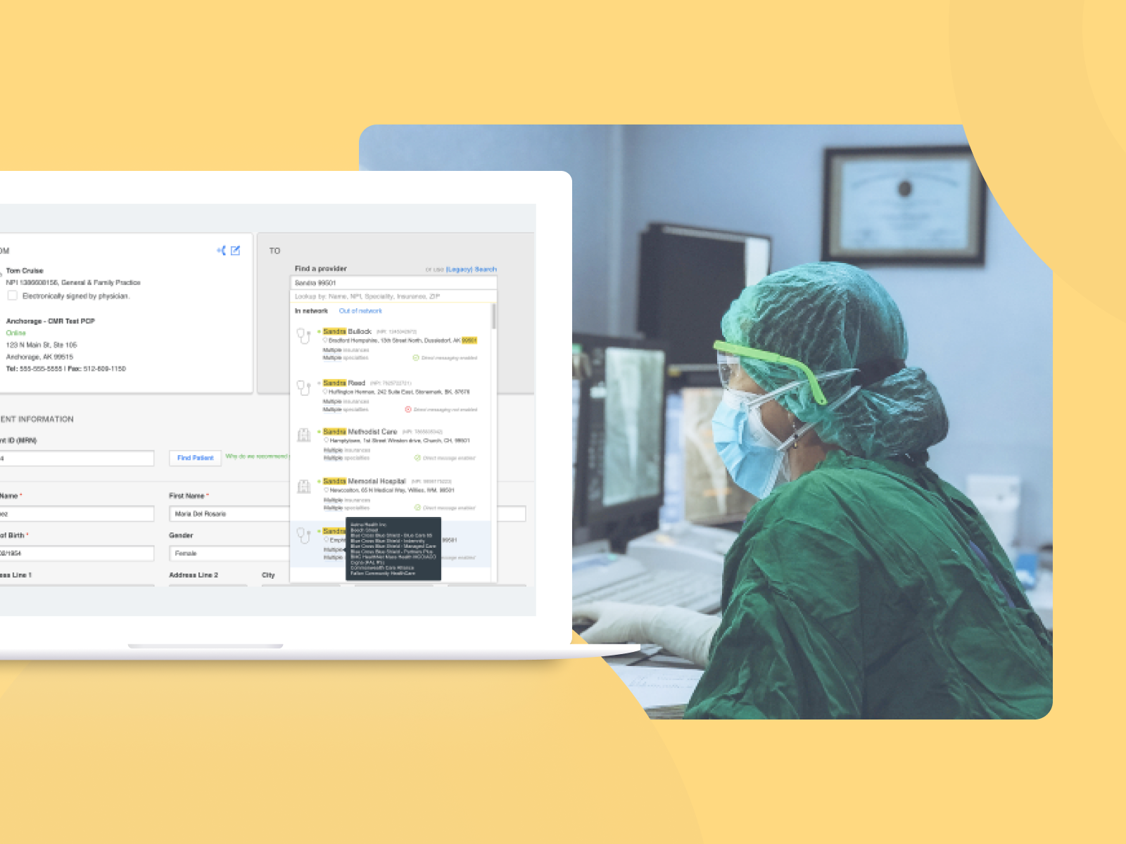
Helping patients find alternative doctors faster.
Feature developed to help patients get referred faster!
The Problem
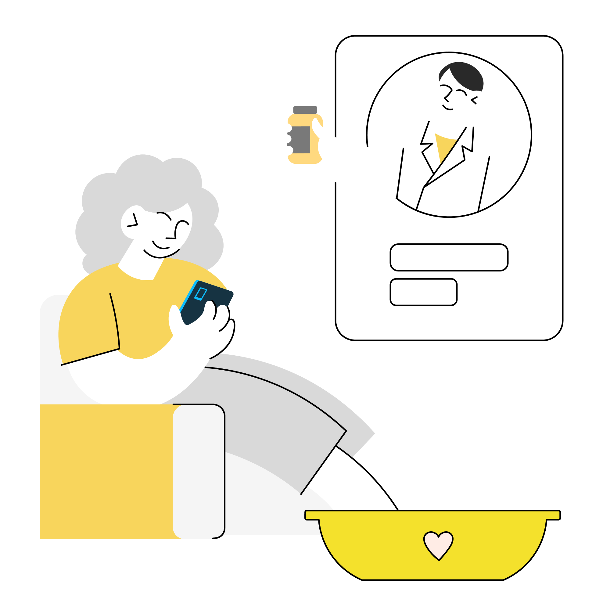
In short: Help the patient find a doctor at a different hospital through a referral system.
Detailed: Direct Messaging is a feature that is part of an effort to make a referral coordinators life easy as well as stay ahead of the market in one of the health care application I was working for. The feature was never built before but the technical capabilities if needed existed. The product management needed help in understanding how and where to position this feature for the users and the best way to approach this to build it.
My Role
Lead at the forefront of the feature design until development.
Understand all the business aspects attached to the requirement.
Conduct an in-depth analysis of the feature, foresee the problems and guide the team towards solution approach.
Use design & research methodologies effectively to propose the feature with user experience solution.
Worked on: Usability analysis, Contextual Interviews, Visual Design,
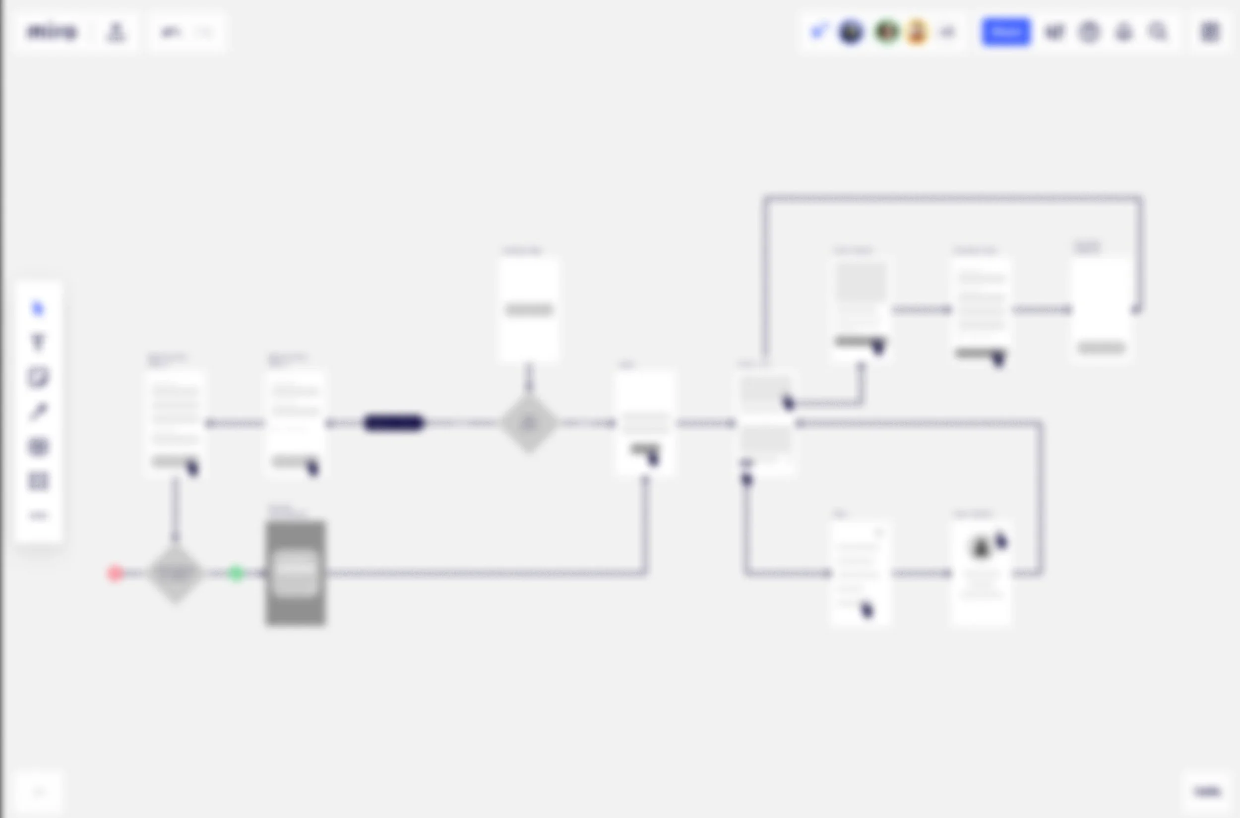
Tools used: Figma, zoom, miro
Our Solution
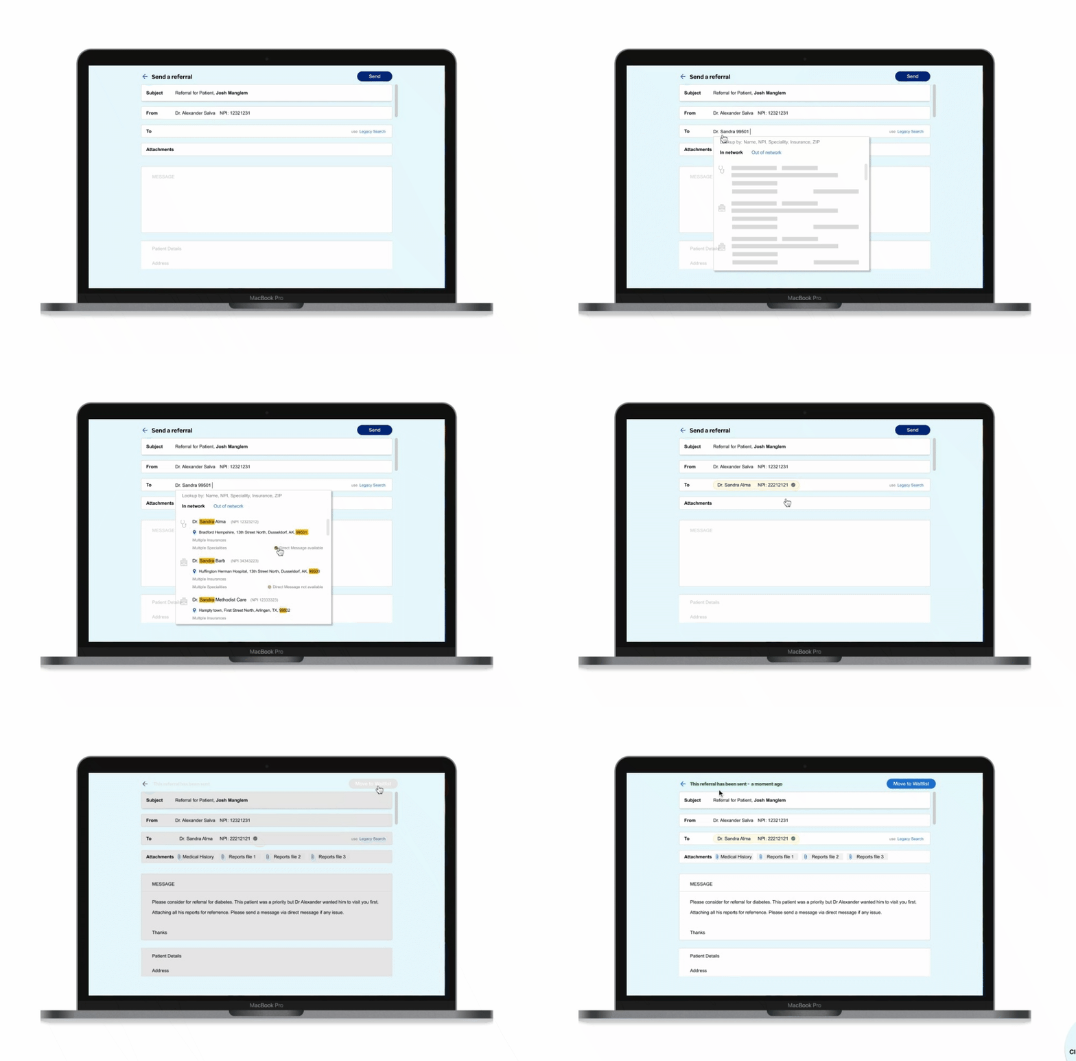
“A simplified approach to finding a physician to refer. As easy as search, select and send!
Improve the user flow as we add a new feature!
Swift
We ensured that the process of sending a referral was as swift as possible by making sure we remove the complexities involved.
Usable
We focused on making sure we address usability issues. Autosuggest and search highlights were introduced to make the app more usable.
Reliable
Our solution introduced the reliability factor using a direct messaging icon that indicates the availability of the feature.
The Process
Researching problem space
What is a direct message?
Our systems define direct message as a single point of contact to a physican or the health system. An example of a direct address could look like john@fischerhospital.com or john@myclinic.com. By enabling direct messaging feature we not only deliver a referral to our own referral system but we notify the physician at their preferred way of communication.
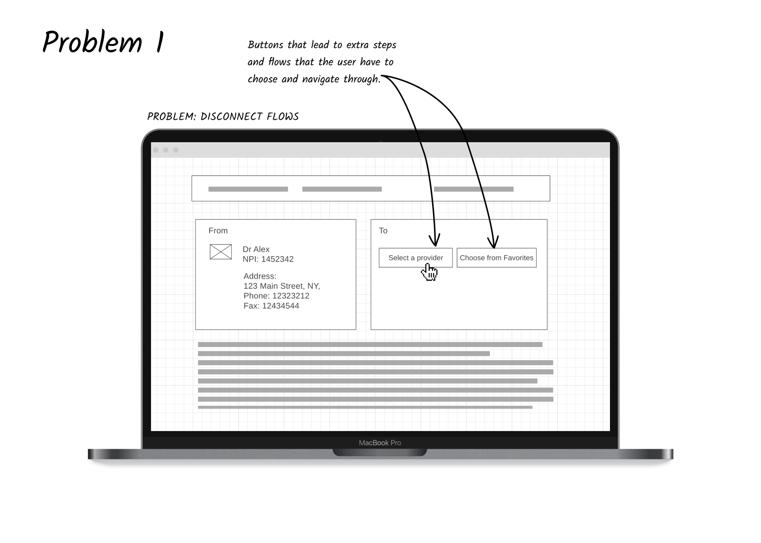
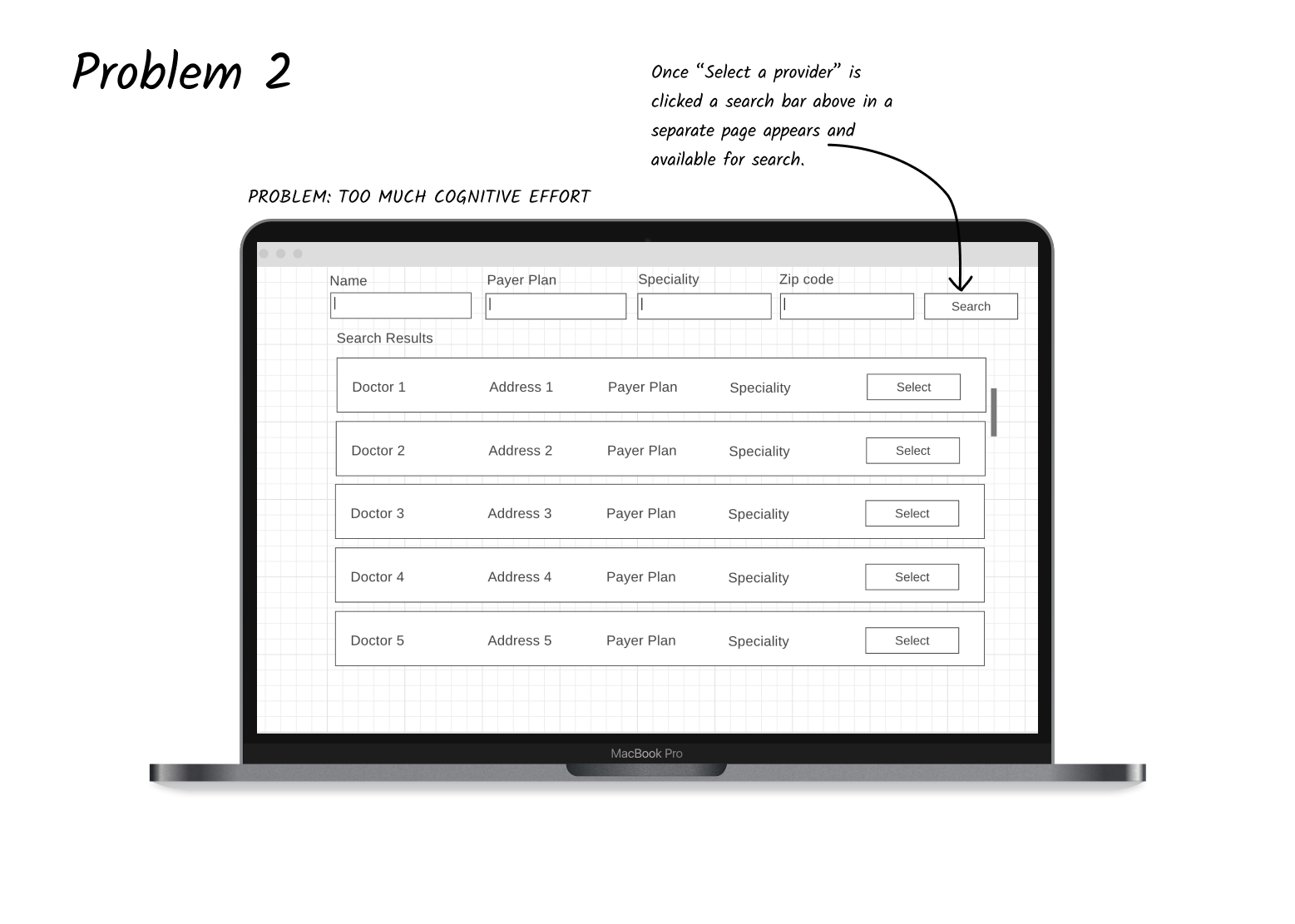
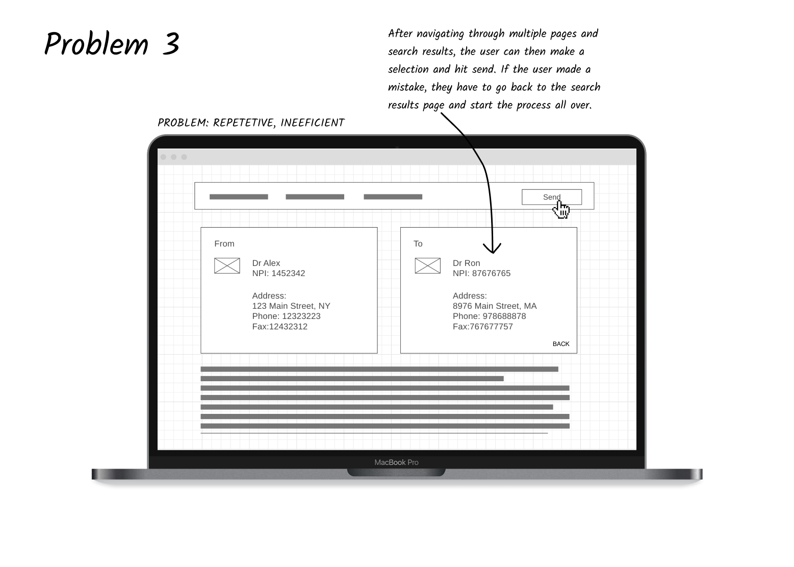
How do users solve this problem today? The user can accomplish these goals but they must navigate to different screens and make specific selections that might not be necessary to their mental model.
Who are the users? Front office staff. Referral Coordinators (referred to as RC in this write up). They operate on behalf of the provider.
Who are the buyers? Bought at the corporate level, deployed to various practices.
Who are the stakeholders? Lead Engineer, Product Manager, Users
How can our application/ feature help?
Our application has created the capability within the application to send a referral as a Direct message. This will enable providers to integrate our application with Direct Message clients which includes EMR's.
Communicate referrals bi-directionally, using Direct.
Send and receive transfer of care documents.
Send and receive lab results, and clinical summary between Our app and EMR.
Below are some solution approaches we discussed.
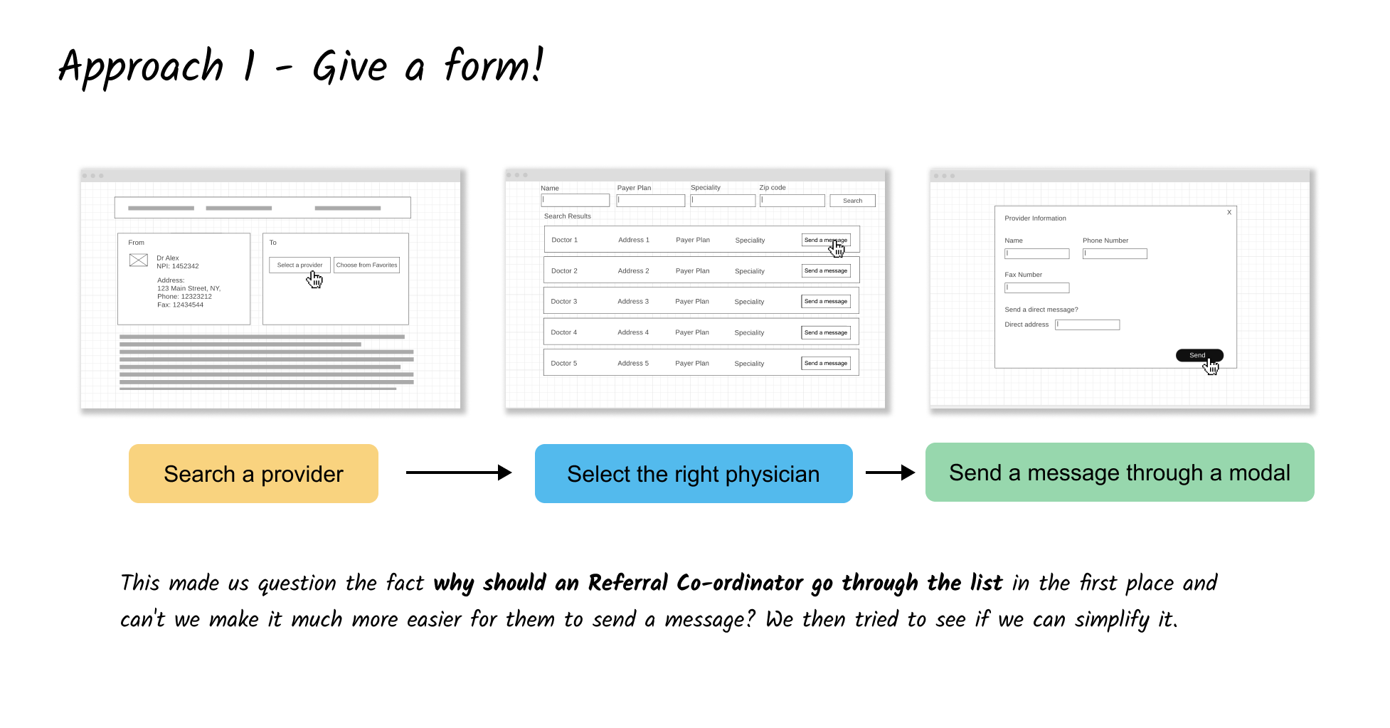
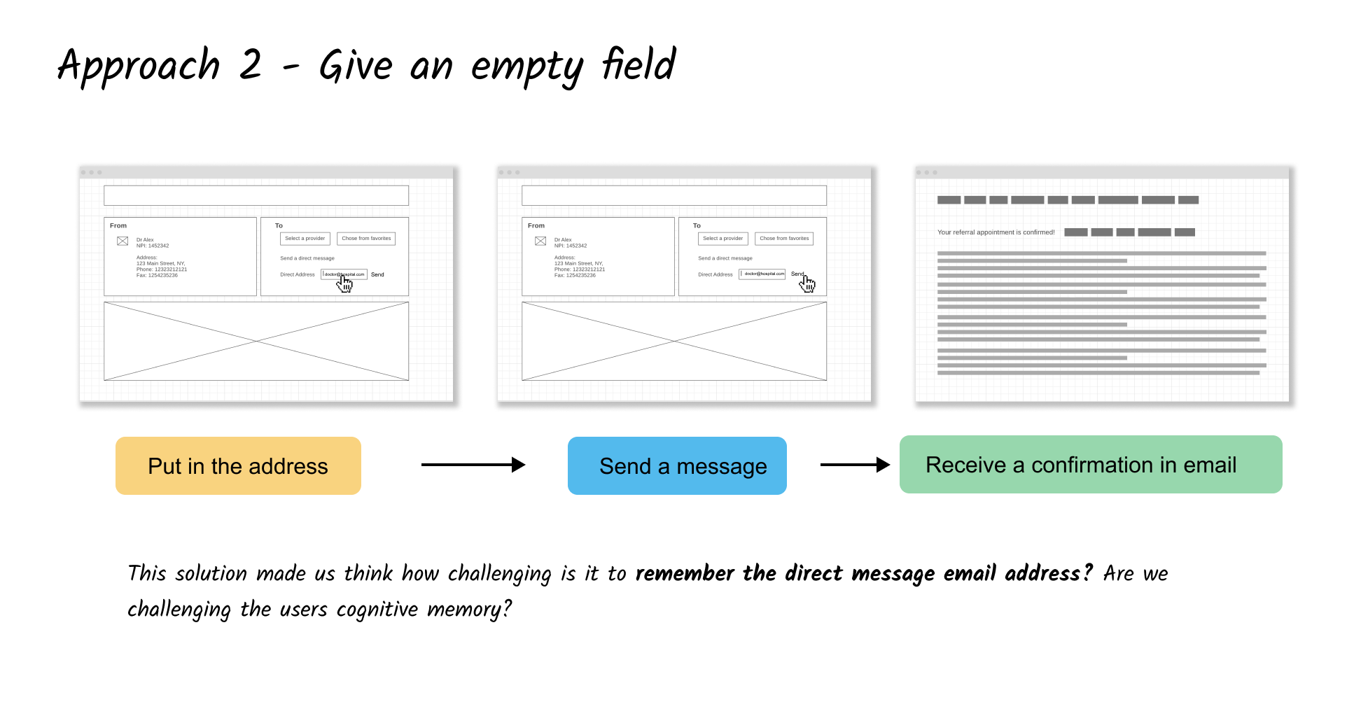
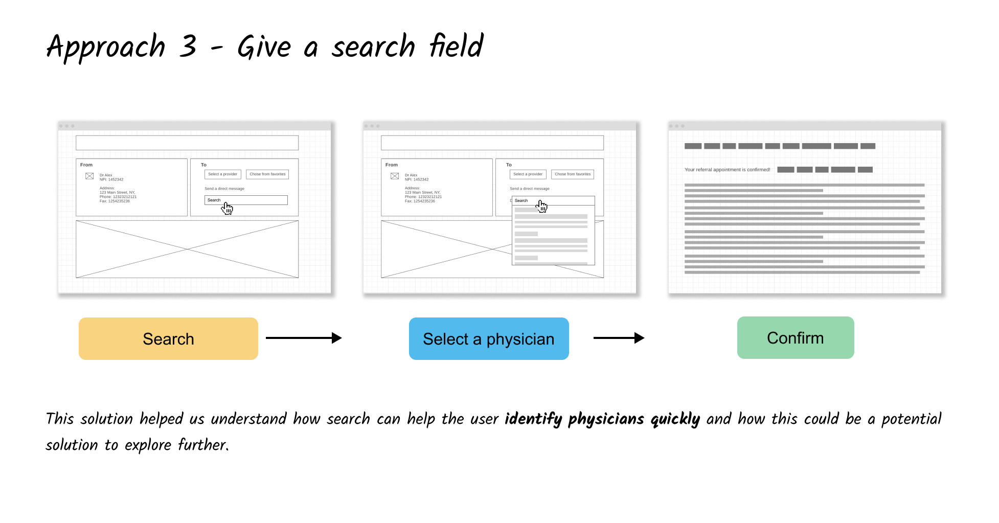
“Adding a direct message feature on its own may be less meaningful when the workflow is not effective”
Team meeting note
We then worked towards fixing the workflow and going with approach 3 as it made more sense to overhaul the task flow while we add these new features.
Solutions we agreed were:
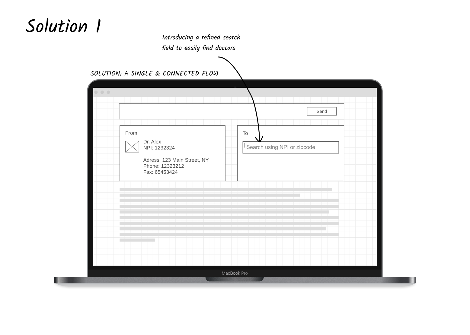
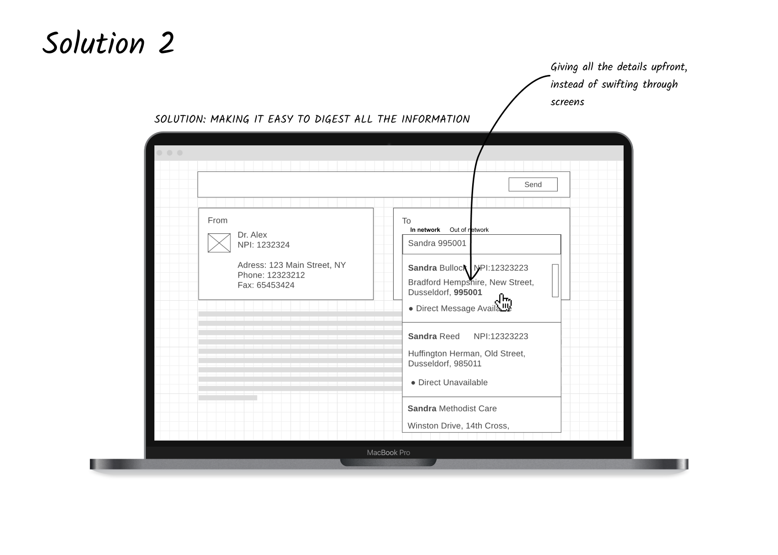
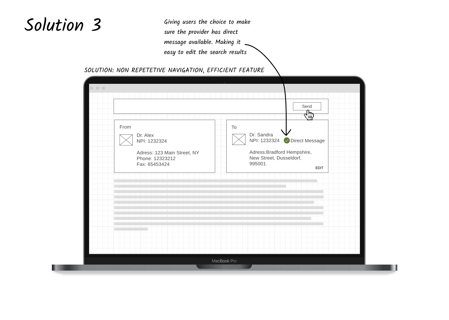
What was different? How did it change?
With the new design approach the user should be able to
quickly look things up and make a decision, make a choice from the available doctors.
to get into the detailed/advanced search if she can’t find anything using a legacy search.
to see if a physician is available via a direct message so that a referral can be processed faster.
Impact
Using a human-centred approach we simplified the user's life to make a complicated search, make a selection and perform an action. By empathising and understanding the user and using divergent and convergent styles of thinking we achieved something which most enterprise applications fail to achieve. A study conducted using analytics revealed that this helped our users find doctors up-to 15% lesser time than usual.
What we could have done better?
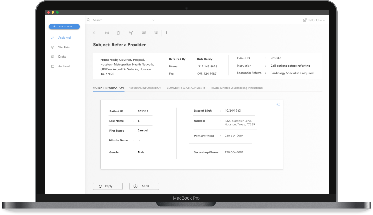
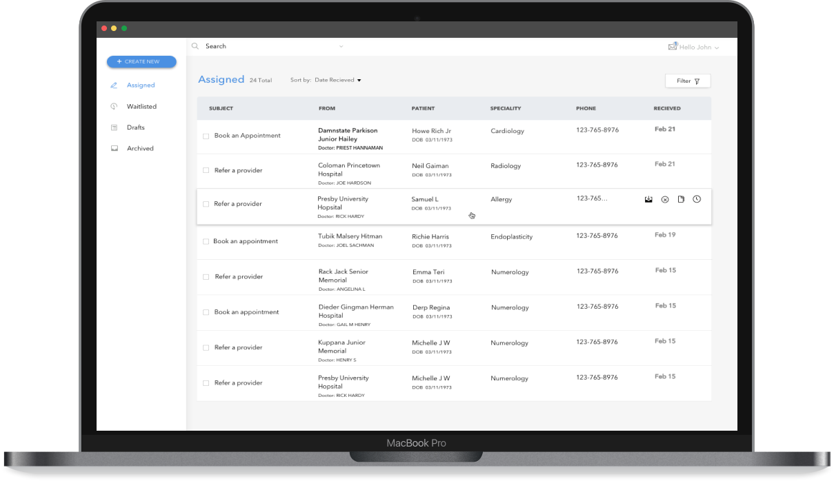
When we worked towards solving this problem, we realised the whole system of referral could actually be improved. The way it currently works is very dependent on users memory. There were instances where the system could get very overwhelming for a user. We redesigned a whole new referral system and presented it to the product and dev teams, it was appreciated by the whole team. We could have been successful if we were able to convince the full enterprise team that the whole process and system needs to be redesigned. We asked ourselves what would it be if we didn’t have any constraints. What would an effective model look like?
Here are a few screens for one of the concepts that won in our team critiques.

My Learnings
Complications should be handled by the system and let the user do what he is wanting to do simply and swiftly. Build features at the same time solve the pain points associated with it.