
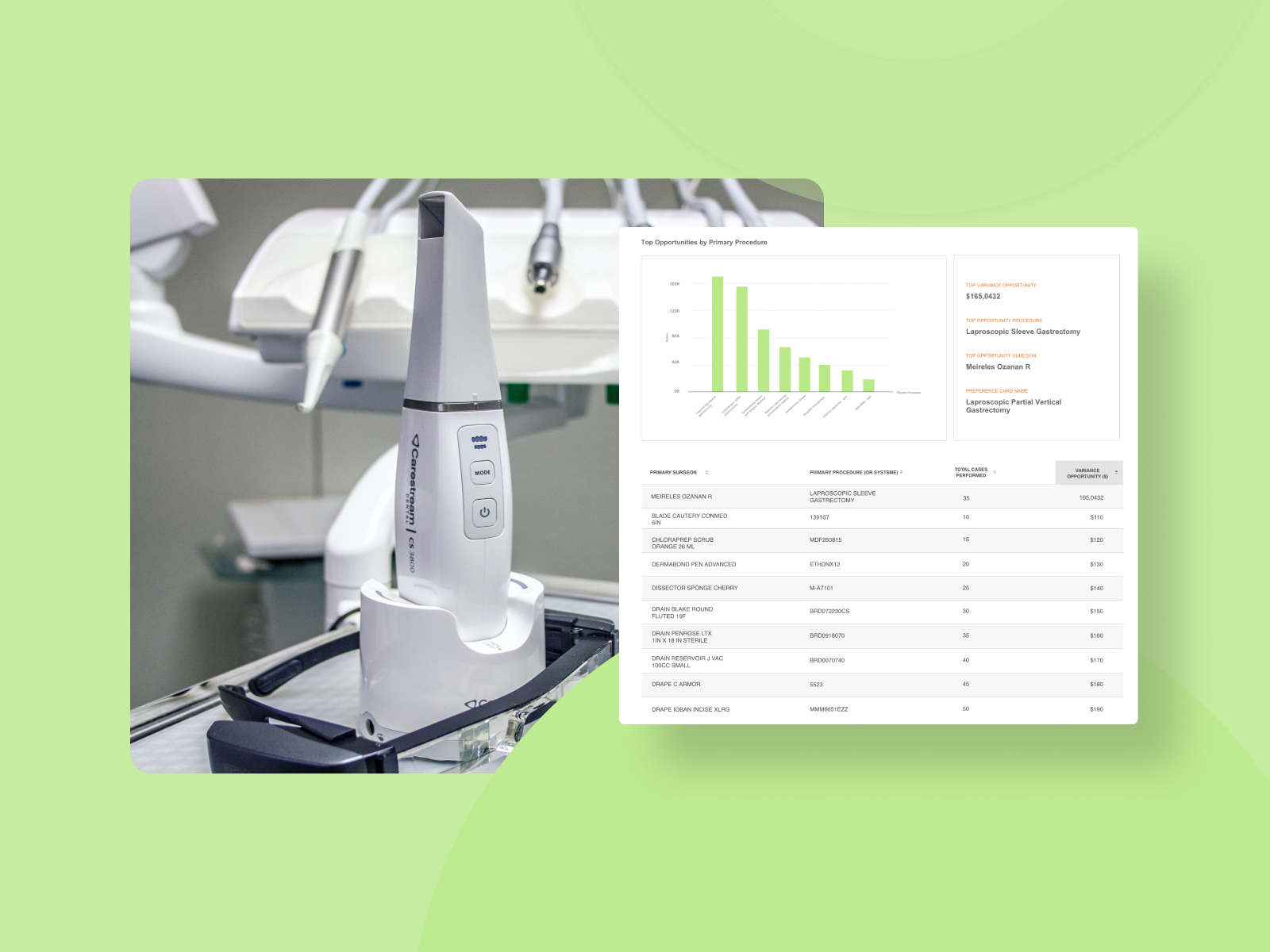
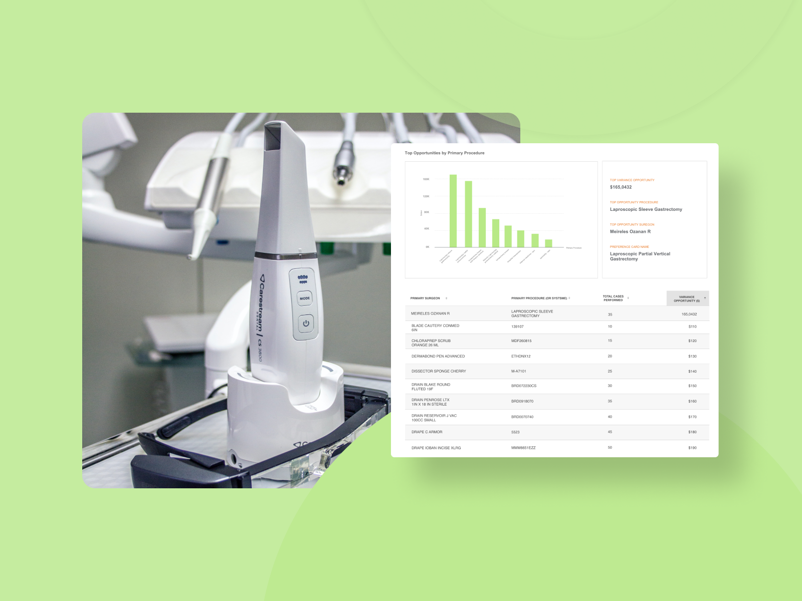
Reduce surgical instrument cost in a surgery
Design solutions backed by user research for “Surgical Instrument Measurement Tool”

The Problem
Is there an opportunity for us to track and help the physicians save on surgical instrument wastage?
Is our tool helping analysts and surgeons do that effectively and efficiently?
Introduction
This project involved Identifying problems in the current user interface and helping the product manager improve effectiveness, efficiency and satisfaction. This was also an opportunity for the UX team to figure out the most important issues our users are facing. This is an outline, action plan, and potential measurement execution for functionality, tasks, and value propositions.
My role: Experience Designer
Team
Ajay Anand - Product Manager
Jack Reddy, Manivannan - Front End Engineers
Worked on: User flows, Prototyping, User research, Usability testing
Tools: Zoom, Gotomeeting, surveygizmo, Figma
Solution - Validate and Introduce new features that benefit the users
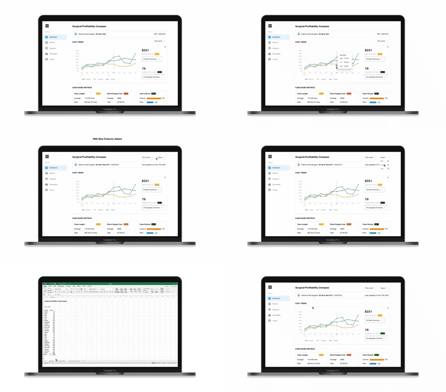
A well researched and simple approach of solving problems strategically and a plan of introducing new features.
Ease of Use
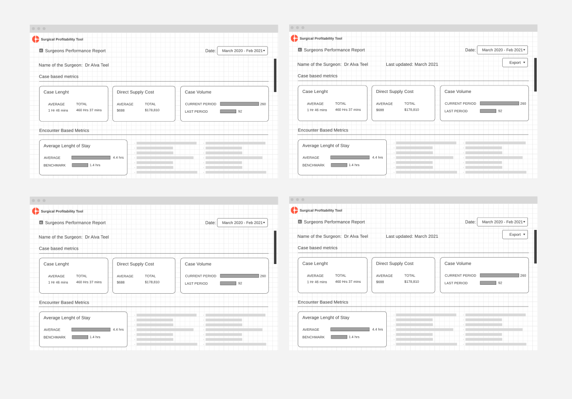
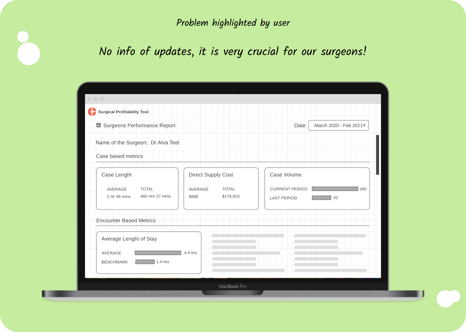
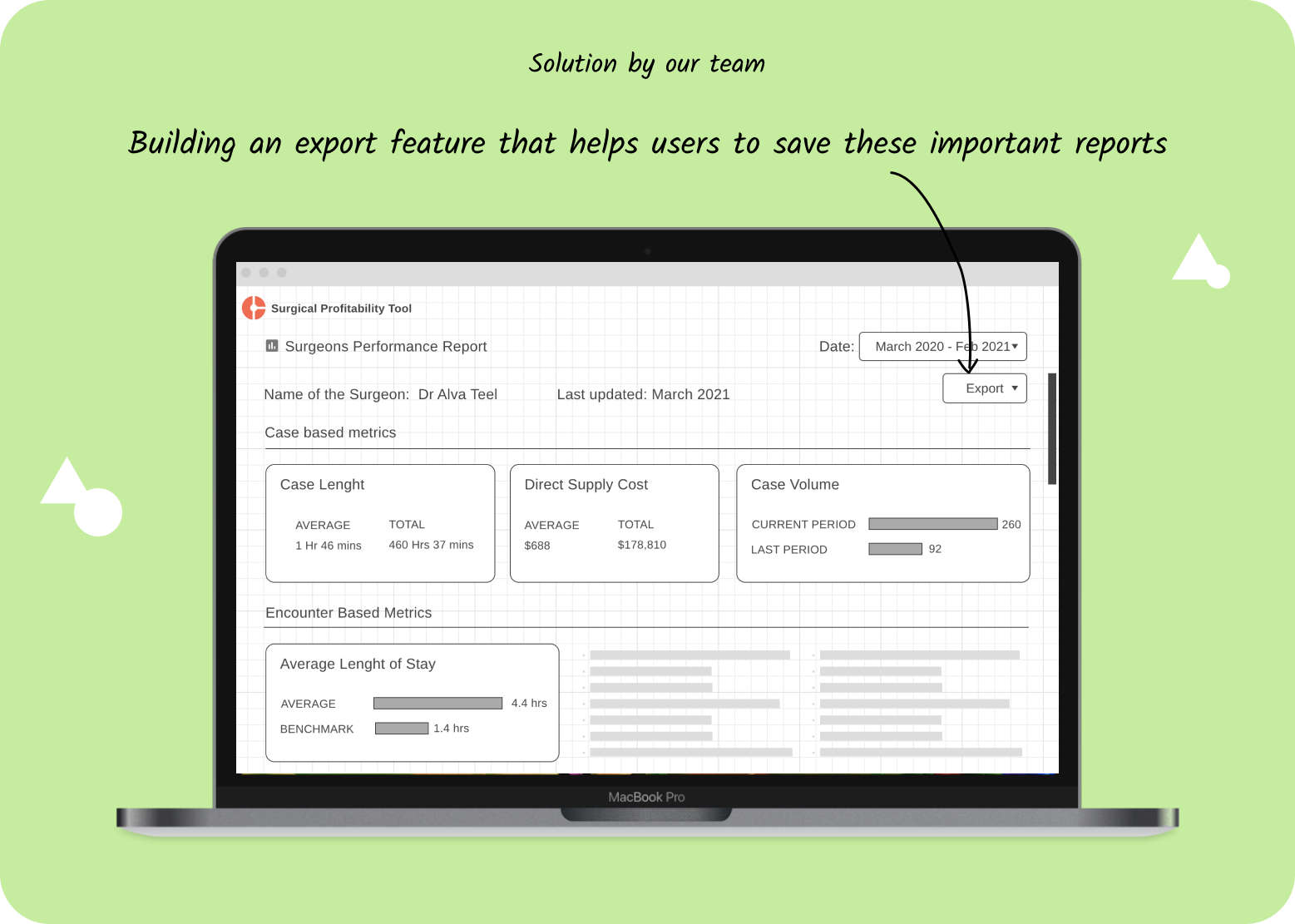
By giving features such as exporting to excel sheets, we gave our users an easy-to-use application. This resulted in our reports usage increase by 32%
Informative
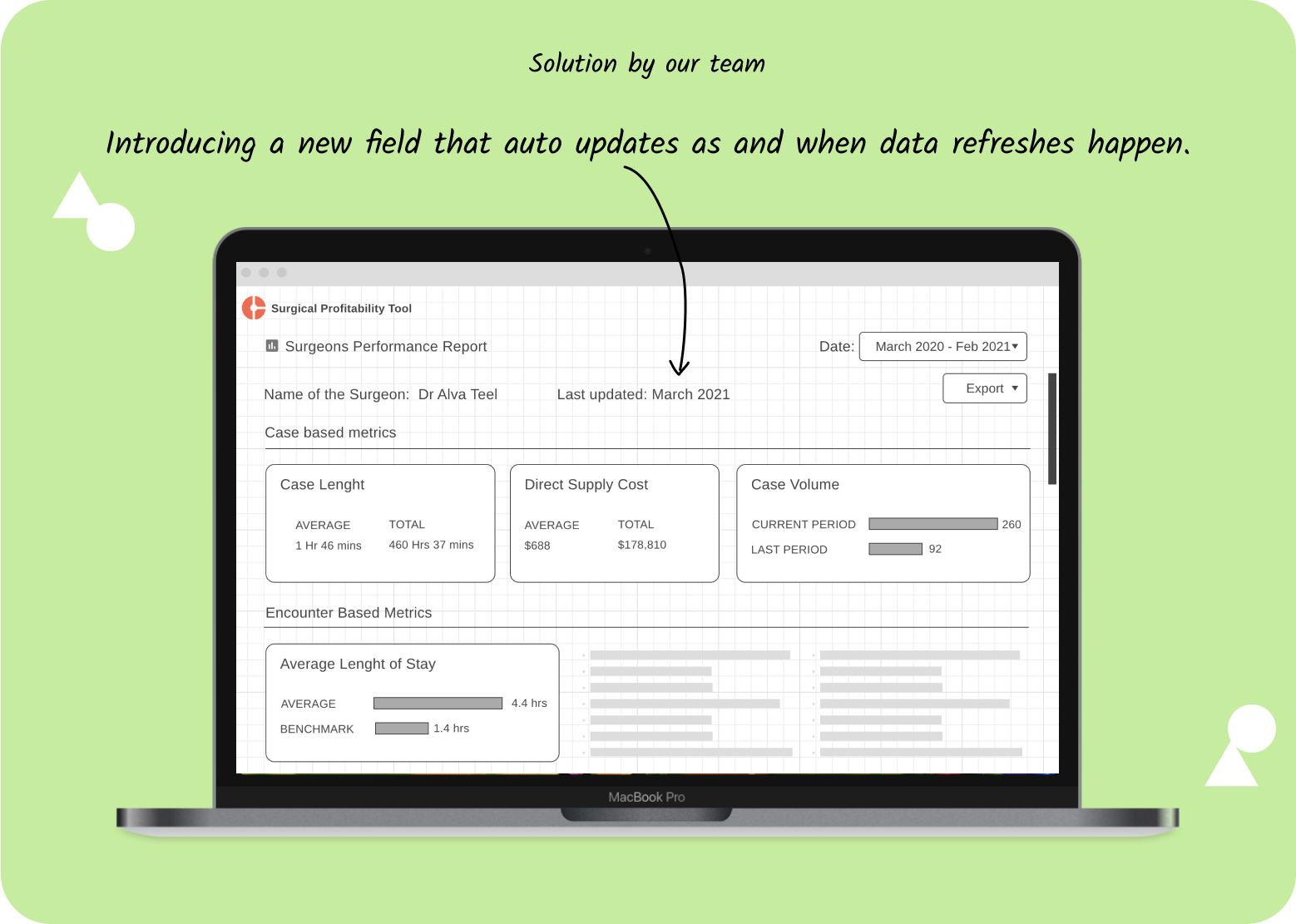
With useful information such as last updated date, our users had the opportunity to understand how valid the information is for the context of use.
Click here to see this prototype in real time
The Process

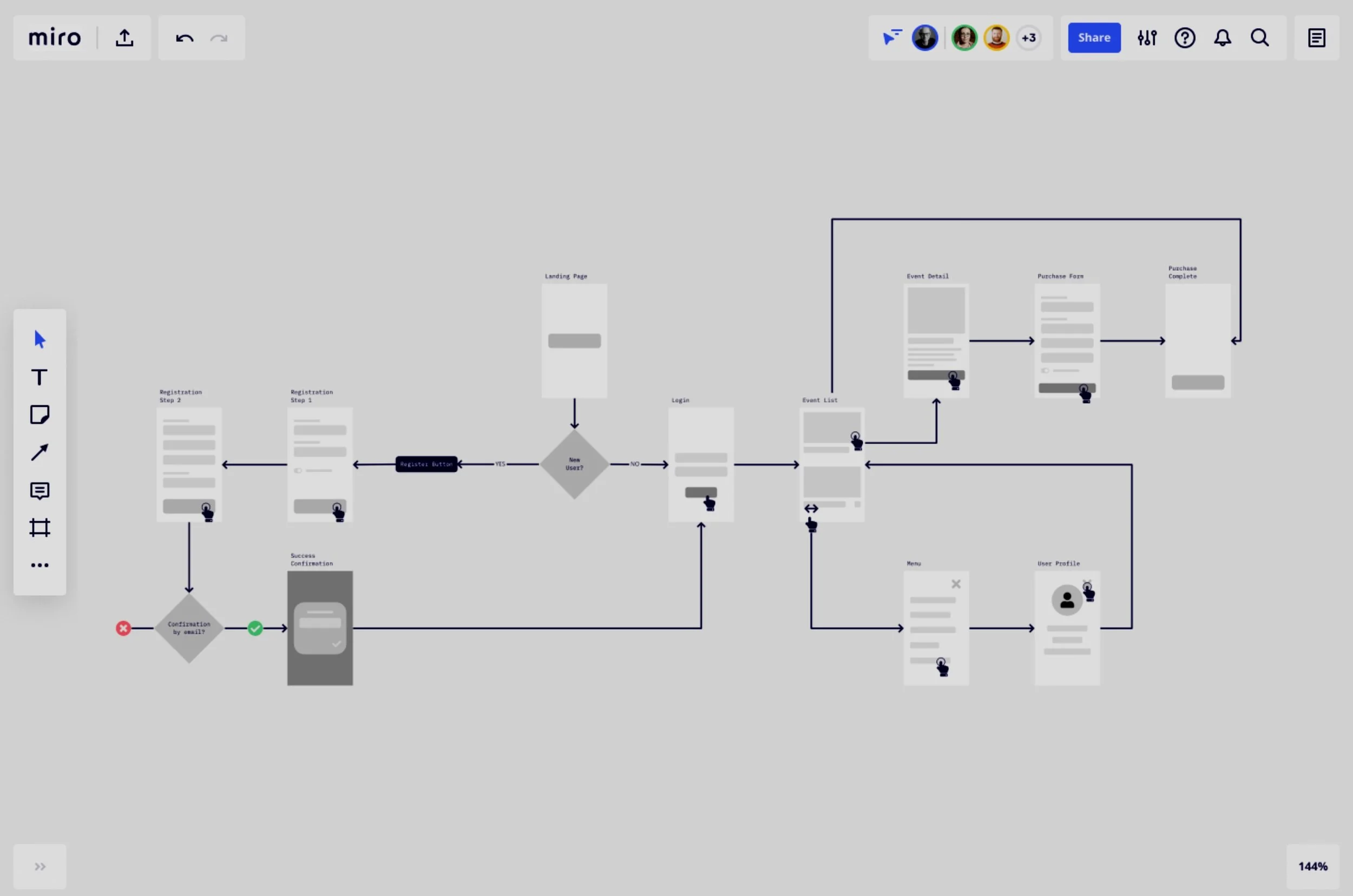
We wanted to jot down all the possible improvements and challenges faced by our users through user interviews. We did it by scoring the effectiveness, efficiency and satisfaction of the users as they perform a set of tasks which we gave them. This would result in possible places where we can improve in our existing tool. We started first with understanding some basics before jumping into solutions. We did it using our effectiveness, efficiency and satisfaction scoring systems.
Effectiveness was graded with Time on Task & Success methodology,
Efficiency was graded using After-Scenario Questionnaire (ASQ),
Satisfaction was graded using System Usability Score (SUS) and a holistic picture of the Overall User Experience.
Researching problem space
Personas

Elizabeth M
Dedicated Advisor
Goals
Finding opportunities and ROI for physicians, hospitals based on SPI data
Validating data and finding solutions when data is not sufficient for activities that the hospital wants to do
Encouraging product adoption
Getting the data to fulfill physician needs even when constrained.
Pain Points
MSTR complexity means hard for members to duplicate their work
Too many points of entry for ROI/opportunity - can be overwhelming
Member data is not always good, causes friction
Pressure to retain members
Not enough time to answer all member questions

Fiona K
Materials Manager
Goals
Manage supply cost spend to budget/savings target.
Guide and manage Dedicated Advisors
Pain Points
Surgeon-vendor relationships
New product introduction
Not sure what price should be as they don't have a way to validate price
Don't know what others are being offered
Lack of price visibility
Physician preference ('PPI' Physician Preference Item)
Increasing costs
Lack clinical knowledge - cannot fully speak to the product and it's use in 'real-world'
Detailed Personas are here

"You're gonna hear all my whining and complaints today, you may not like it
William Moore, Head of Materials - Famous Hospital
User Research
We started off with a simple user study, however, our team decided that it would be a good opportunity to conduct a thorough usability study and not just limited to the current problem. We decided to expand the scope of our research more broader. We decided to measure our success using these metrics.
Time-on-task (Efficiency)
Task completion (Effectiveness)
Task satisfaction (Satisfaction)
Tasks
Below are the specific scenarios and tasks we asked participants to complete:
Task 1: Identify a high-cost item used by a surgeon for a procedure across facilities
Task 2: Find the utilisation of an operating room in a facility
Task 3: Find a block-holder whose block utilisation is the lowest in an operating room
Task 4: Identify the price points of items across the cohort
Task 5: Find the number of cases performed by a primary surgeon in the last month

Task Success
System Usability Score (SUS)
SUS survey responses and task ratings (ASQ): Our users are generally showing slight dissatisfaction with the tool as it sometimes has issues that needs to be looked into. Overall consensus indicates that the product is slightly difficult to understand to use, though not necessarily always intuitive. Our statistical average, or mean, SUS Score of 63 is below the average score of 68.
Design Implications
The SUS scores and the interviews revealed where the issues lie and what we can focus on in the upcoming sprints. This impacted our overall design thought process and gave us directions for which problems we can prioritise. Here are some of the problems that users spoke about.
1. Application Loading times: (By Robert Williams, Alexandre Warman)
Observation: Participants significantly experienced long load times. This was seen in most of the participants common experience while using the SPC Application.
Comment: “Every once in a while it is so slow!!” - Alexandre Warman.
Next Steps: Look for what could be slowing the application and if we can work on minimising it.
Action Item: Scheduled to work in the next sprint
2. Information Lag: (By Robert Williams, Alexandre Warman)
Observation: Participants also shared that the information they see is mostly not up to date, meaning the information is not recent or new enough for them to be able to do an analysis.
Comment: “The information isn’t updated, the information isn’t sent to the server frequent enough from our electronic health record and so sometimes the data lag is behind, so if someone wanted to know our volume yesterday, Friday or Monday, I wouldn’t be able to get that out of the compass.” - Robert Williams
Next Steps: Look for causes of concern where data is not up to date and if there is a way to minimise it.
Action Item: Scheduled to work in the next sprint
3. Information Sharing: (By Robert Williams, Alexandre Warman)
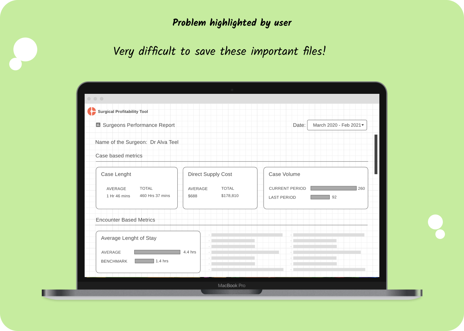
Observation: Being able to export information visualization so that users can share it with someone within the team would enhance experience.
Comment: “I think it needs to be able to export the data to show some of the graphs and things….You cant export the visuals of like your utilization…so that's something that I would like to see put into practice” – Diane Robaska
Next Steps: Work along with PM to see if this can be implemented, the PM did share that there are plans of working on it with the user.
Action Item: Scheduled to work in the next sprint
Wireframes
Impact
Back to the problem statement:
Are physicians using their equipment needed for performing surgery wisely? We worked with our research team to figure that out and set a benchmark for us to look back on improvements.
Is there an opportunity for us to track and help the physicians save on wastage? We understood that there are opportunities and added them to our list of things that can be further researched on.
Is our tool helping analysts do that effectively and efficiently? We figured that there were some basic features that were blocking the analysts do their job efficiently such as export and worked towards building those features.
We could see significant improvements on our feedback from the analyst users of the tool, the next sruvey conducted revealed that there was an improvement in the SUS score of 67.

What could be better?
Instead of working on a feature level of the already poor usable legacy application. It was time to rethink the entire conceptual model of the application. I wish we had the opportunity to do so.