
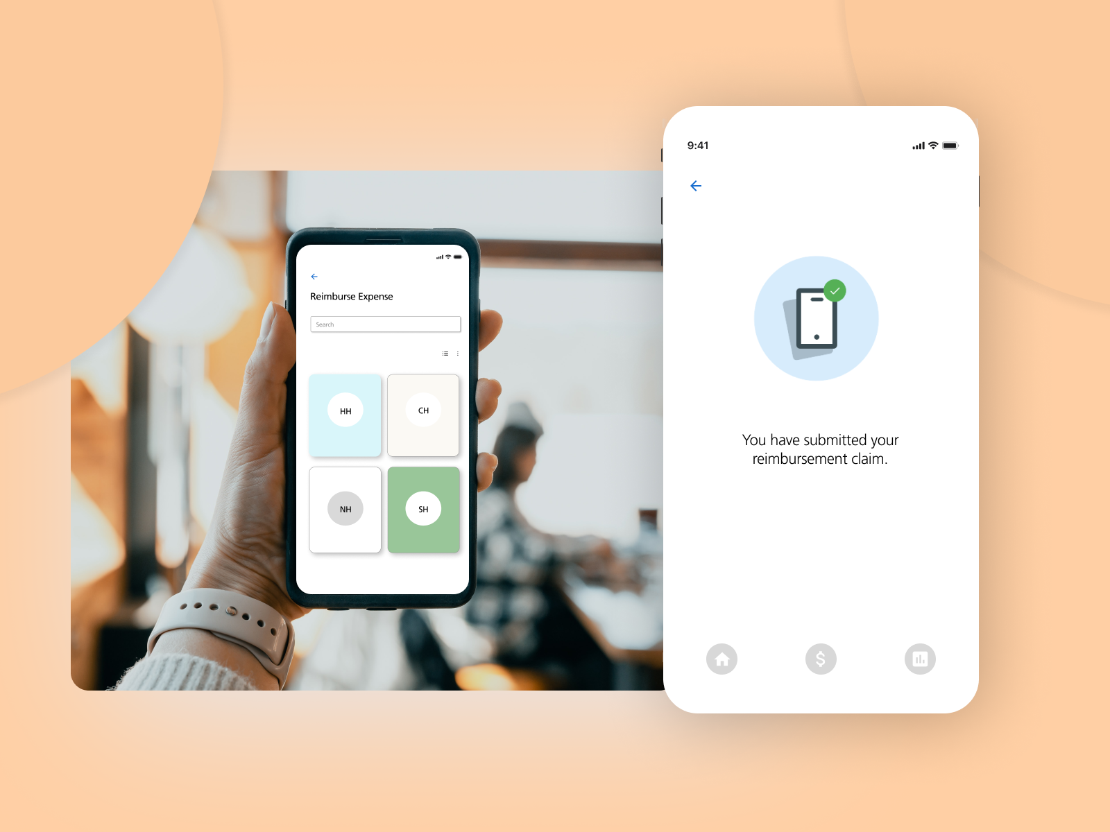
Improve patients’ claims reimbursement process
Fixing the medical reimbursement process in a mobile app

The Problem
Patients are having a hard time claiming a reimbursement in our app. How can we simplify the process?
My Role
Help the team get a direction on the problem
Stick to design principles and collaborate with business and development.
Back decisions based on data.
SKILLS USED: UX Research, Interaction design
TOOLS USED: Figma, Excel, paper and pen.
Our Solution
Revised workflow with new interaction design.
Make it as simple as attach and submit.
Simple
We simplified the workflow to make the solution simple and focused.
Fluid
We made enhancements to the user flow making it more fluid.
Consistent
Our workflow was very inconsistent, we tried making sure those inconsistencies were removed.


The Process
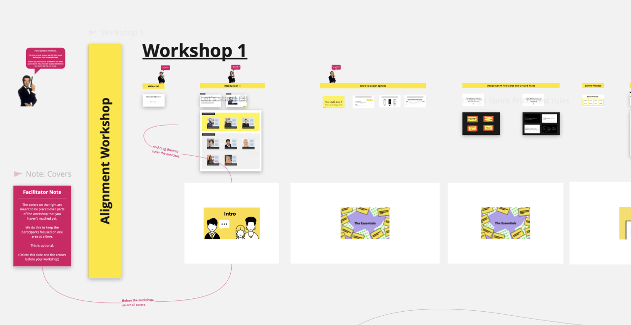
I went through all the comments made through the app, website or in the app stores for both android and iOS. I tried locating themes and understanding the major concerns that our users have voiced in the last year. Here is a sample of that data, for the sake of confidentiality, I have only included a few and the way we collated the data.
Here’s a sample of how the synthesised data looked like
As you can see some patterns started emerging and bubbling up to the top and some went down. We could see that users were having problems uploading receipts into the app. Uploading a receipt to claim their insurance is one of the most common tasks that the user performs in the app.
Researching the problem space
Validation
I spotted a few commonalities in the comments made by users and the heuristic analysis. I then decided to grade all the collated tags according to their severity.
How we decided to attach a severity was an interesting approach that we took out of the book, Think like a UX researcher.
I took the decision tree from “Think Like a UX Researcher” for classifying the severity of a usability problems
Source: Think Like a UX Researcher - How to Observe Users, Influence Design, and Shape Business Strategy by David Travis & Philip Hodgson
Here’s how I graded the severity
Critical: This usability problem will make some users unwilling or unable to complete a common task. Fix urgently.
Serious: This usability problem will significantly slow down some users when completing a common task and may cause users to find a workaround. Fix as soon as possible.
Medium: This usability problem will make some users feel frustrated or irritated but will not affect task completion. Fix during the next “business as usual” update.
Low: This is a quality problem, for example, a cosmetic issue or a spelling error. note: Although this is a minor issue in isolation, too many “lows” will negatively affect the credibility and may damage your brand
None: These are comments which have incomplete information
Analytics
I also wanted to make sure that the list of items we were after has some data and if the data is actually saying anything different than we assume. Here’s an example of what one of the dashboard pieces looked like from our analytics.
This is one piece of the dashboard that showed us how users were quitting right after trying to access the receipts folder page. The fallout of 98.9% confirmed that there was indeed a problem.
We could see that the problem was evident, However, this could be due to multiple reasons, the first that came to our mind was if there was a technical glitch. We stress-tested the app with our quality and dev teams to get a confirmation that there were no issues from tech and development perspectives.
We later looked at data (as discussed earlier in the Analytics section) that confirmed that the problem was real. However, we did not want to solve problems at a surface level but to understand and eliminate everything that causes concerns even in the next sprints or developments, thereby saving effort, time and money for the future :)
Problems we worked on
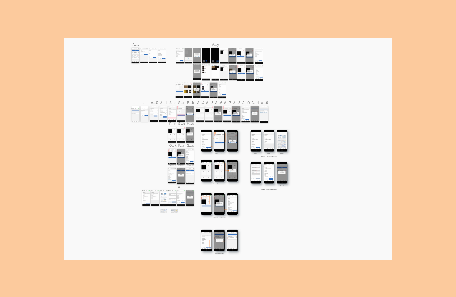
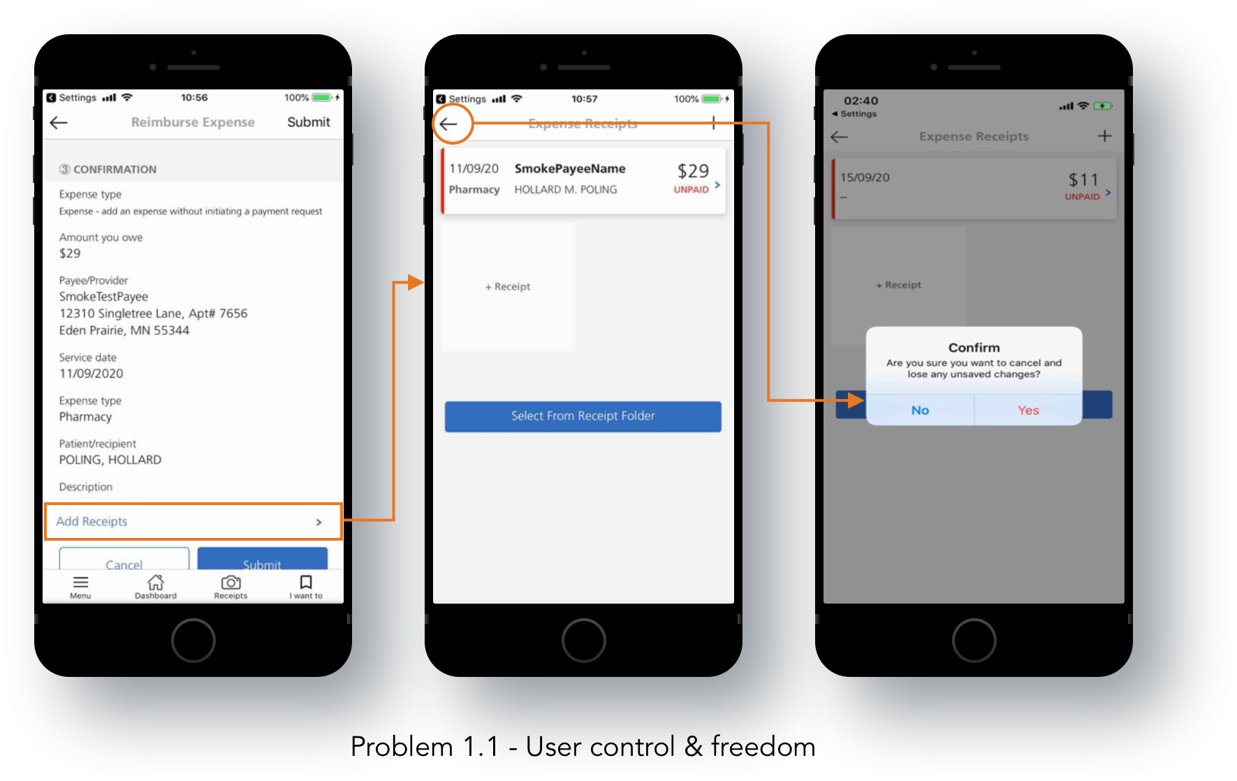
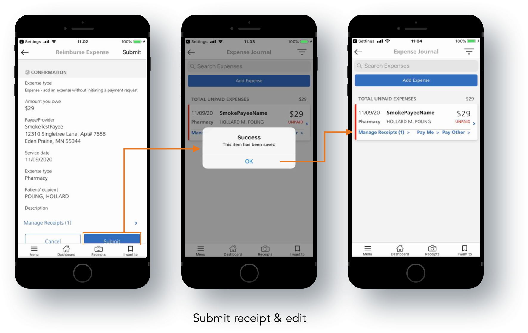
Problem 1.1 - User control & freedom
Users often perform actions by mistake. They need a clearly marked "emergency exit" to leave the unwanted action without having to go through an extended process.
When it's easy for people to back out of a process or undo an action, it fosters a sense of freedom and confidence. Exits allow users to remain in control of the system and avoid getting stuck and feeling frustrated.
In our screen problem 1.1 we can see that After filling in a reimbursement form and clicking Add receipts > if a user performs a back or undoes his action > He is thrown an error that asks if he’d like to lose all his work.
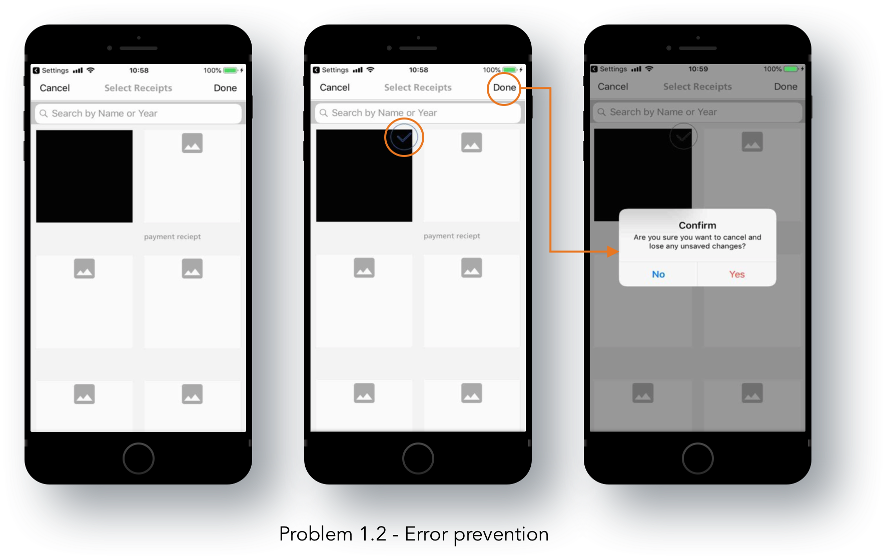
Problem 1.2 - Error prevention
Good error messages are important, but the best designs carefully prevent problems from occurring in the first place. Either eliminate error-prone conditions or check for them and present users with a confirmation option before they commit to the action.
There are two types of errors: slips and mistakes. Slips are unconscious errors caused by inattention. Mistakes are conscious errors based on a mismatch between the user’s mental model and the design.
In our problem 1.2, The error is caused neither due to a slip or a mistake but a conscious effort to complete his action and should not be presented with an error.
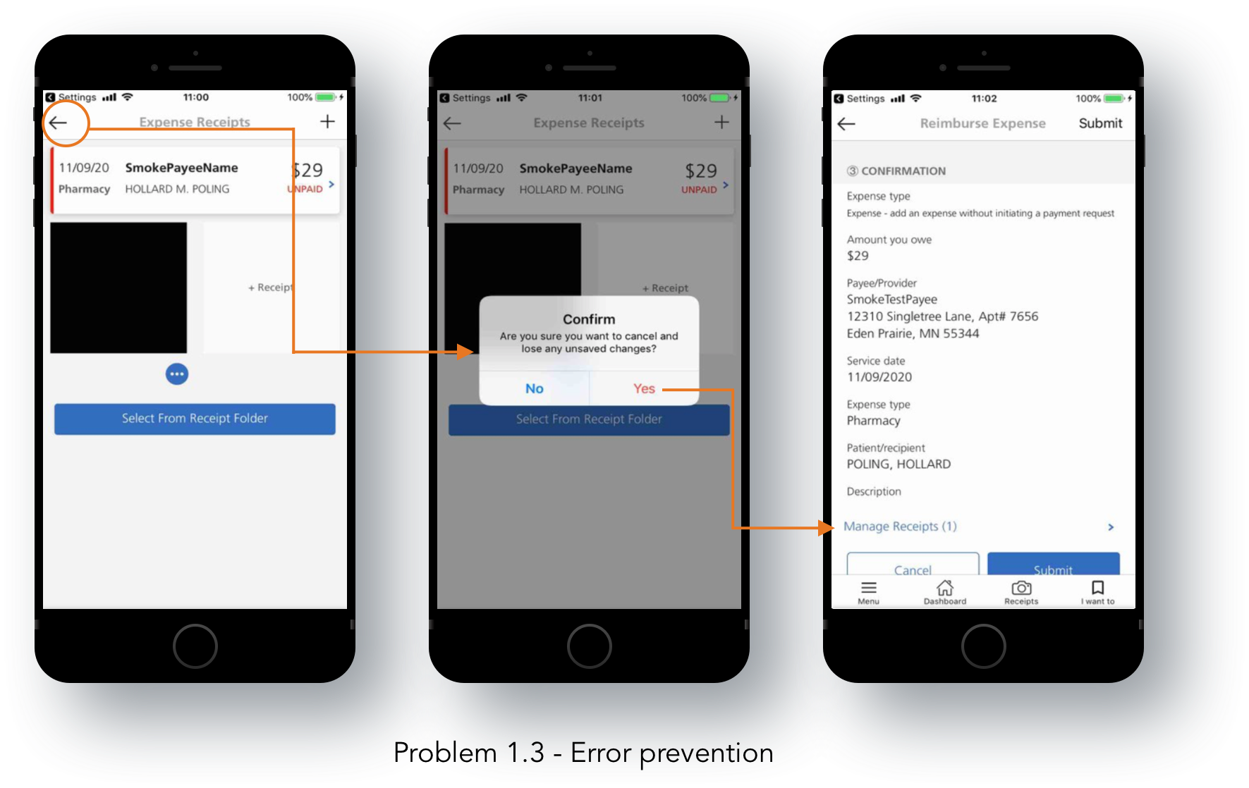
Problem 1.3 - Error prevention
In this screen, we can see when the user is trying to progress and if mistakenly hits on the back button, there is an error.
Submit receipt & edit
This screen completes the receipt workflow.
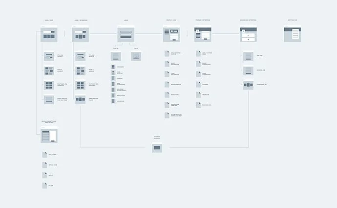
Wireframes
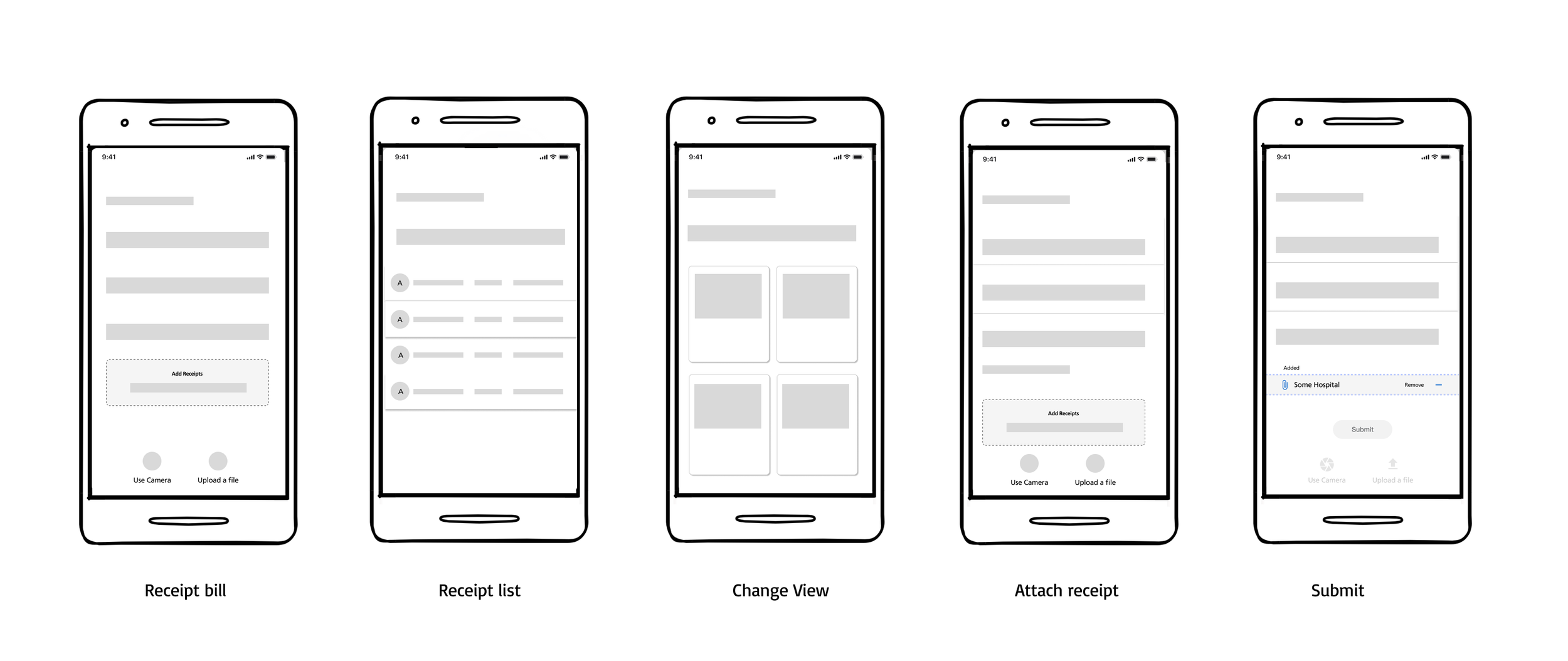
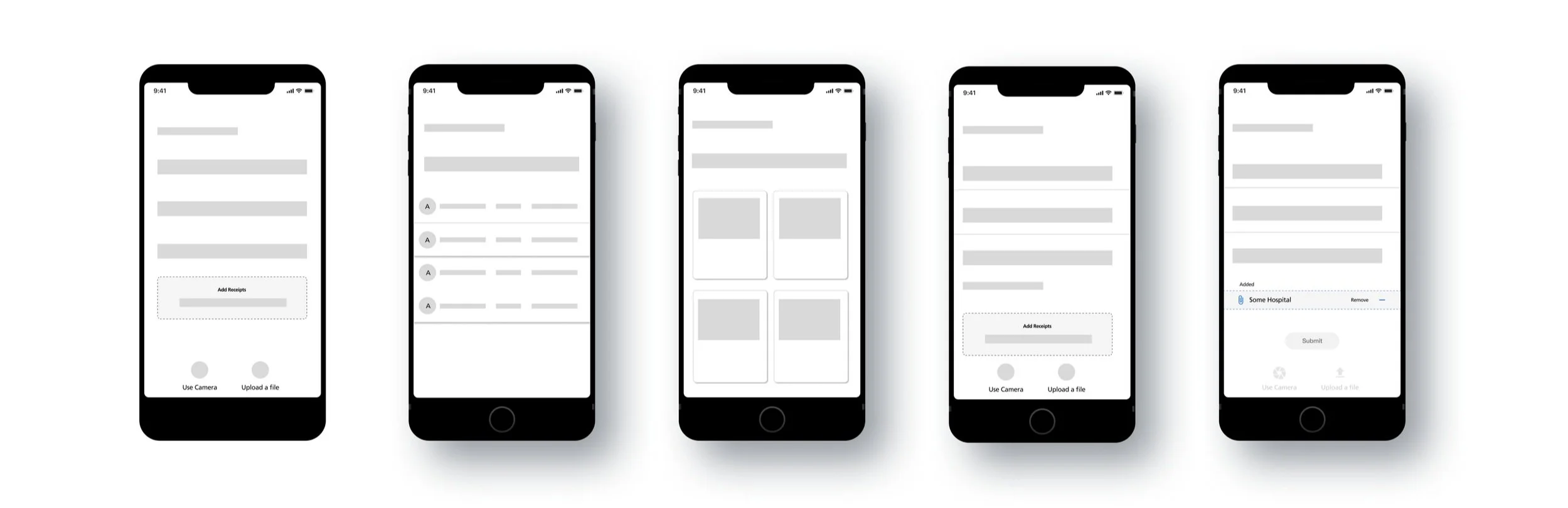
Solutions
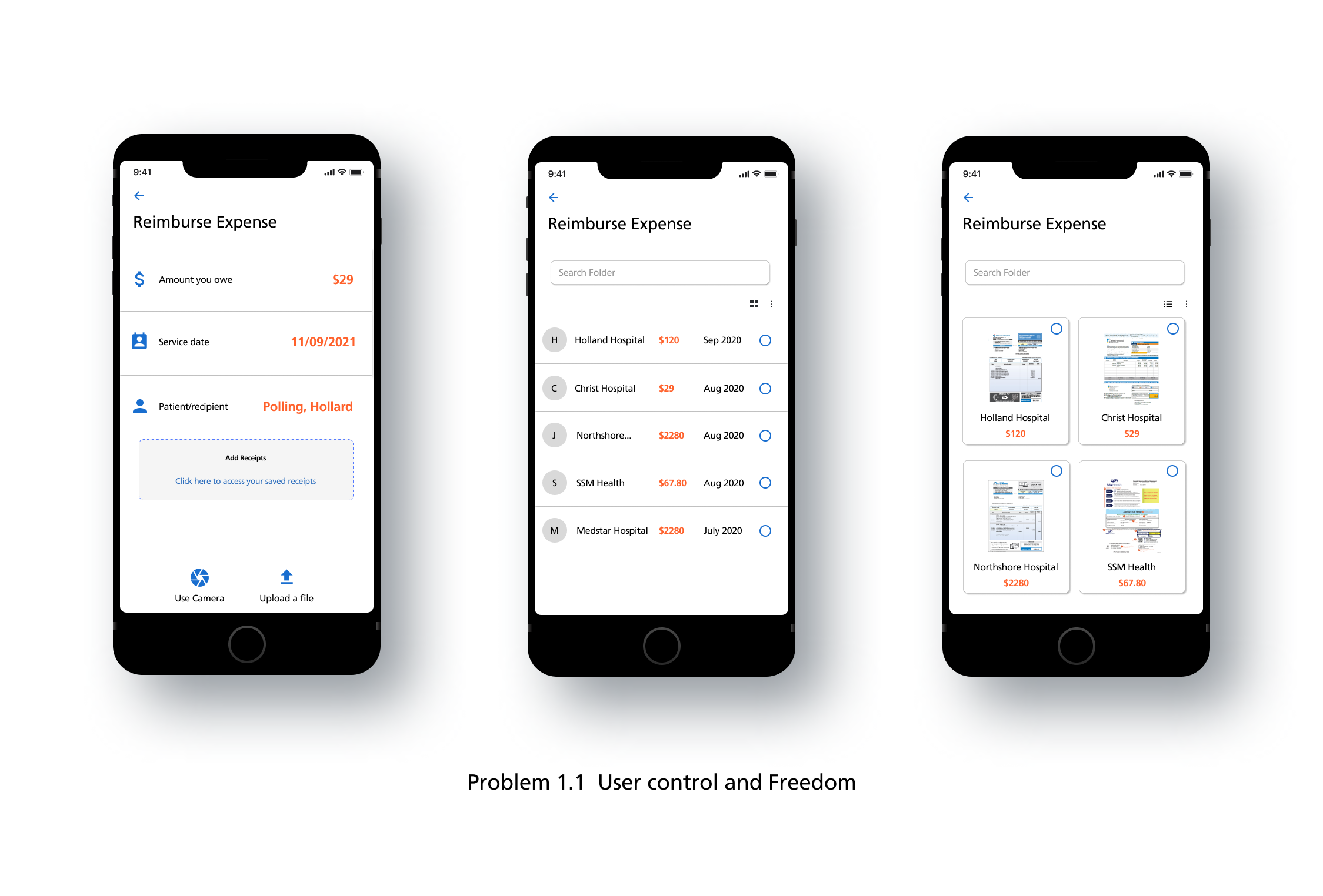
Problem 1.1 - User control & freedom
Users often perform actions by mistake. They need a clearly marked "emergency exit" to leave the unwanted action without going through an extended process.
When it's easy for people to back out of a process or undo an action, it fosters a sense of freedom and confidence. Exits allow users to remain in control of the system and avoid getting stuck and feeling frustrated.
Solution: In our screen problem 1.1, we can see that we give the user a choice of using a camera, uploading a copy if he has one already or going to his receipt folder, by doing this, we give the user his complete control & freedom to do what he liked to do with it instead of us walking the user through the process, the onus of deciding which path to pursue lies on the user, thereby increasing the experience.
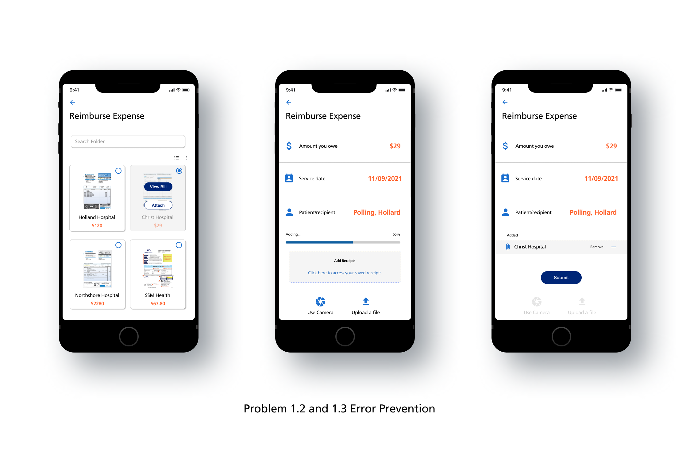
Problem 1.2 & 1.3 - Error prevention
Good error messages are important, but the best designs carefully prevent problems from occurring in the first place. Either eliminate error-prone conditions or check for them and present users with a confirmation option before they commit to the action.
There are two types of errors: slips and mistakes. Slips are unconscious errors caused by inattention. Mistakes are conscious errors based on a mismatch between the user’s mental model and the design.
In our problem 1.2, The error is caused neither due to a slip or a mistake but by a conscious effort to complete his action and should not be presented with an error.
Solution: We prevented further errors by carefully giving features that help users reduce the chances of committing mistakes, to begin with.
Impact
By following a rigorous process of discovering, defining and solving problems for our users step by step, we achieved something that most teams fail to achieve. ie; solving the right problems. By understanding our patients’ financials and their problems in submitting their claims using a receipt, we were able to reduce user complaints and escalations by 13%.
My learnings
More often than not we blame users for a fault in the design.